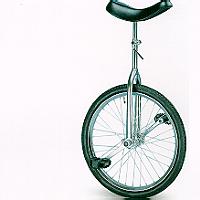
 Is your website a unicycle, a vehicle that requires much training and skill before it can be used? While there are so many “beautiful” websites online, some simply don’t make sense. Have you ever found yourself on a website that seems quite impossible to use? Even worse, landed on a website after doing a search only to wonder why you are there at all?
Site usability is possibly one of the more important factors of a top performing website. While so many will argue that the site is nothing without a genuine web presence, I will argue that some websites rely purely on offline marketing. At the end of the day, if your website is impossible to use, nobody will be able to (or even want to) use it. Points to ponder when designing your website:
1. Navigation
2. Login/Signup
3. Onsite search
4. Flash and other multimedia
5. Bookmarks/Favourites
6. Contact
1. Navigation
This may seem like an obvious point but as most visitors are more likely to find your homepage, are they able to navigate to the section of the website that best relates to their needs? Simple text navigation will also make it easier for the search engines to index the individual pages of your website (where have you heard the design the website for a human visitor before?).
2. Login and Signup’s
Does your website require that visitor’s to login; do you want new visitors to signup for your newsletter (or other services)? If so, is it possible to do so from the homepage? While you may not want to place a login on the homepage, a link to a login page will suffice. Again the key is to keep it simple and clear as to what you expect of the visitor.
3. Onsite Search
This is crucial for any website that offers a large quantity of information or products. Can you imagine trying to find an item among 2,000 by going through a product list 10 items at a time? I didn’t think so. Offer you visitors what they are looking for by adding a simple search to your website. This should help speed things along. Many websites have a quick search option towards the top right-hand corner of the homepage (sometimes this spans the entire website in all the headers). Keep it simple, visible and obvious. Make sure that the average visitor knows that this is a search function.
4. Flash and other Multimedia
Okay so Flash is a pet hate of mine. But the same could be said of all multimedia that simply clutters a website. Remember that while multimedia and other interactive agents can at times seem really cool or even a good idea, some visitors don’t have advanced updated browsers. That said, sometimes the best way of doing something is through the use of these tools. Make sure that these are placed on well marked pages with an explanation of what they are about. This way, if the visitor is unable to view the contents the at least know what it is about and why they can’t view it. Otherwise they will simply think that the website doesn’t work and leave. After all, what use is a website that is broken?
5. Bookmarks and Favourites
If you want returning visitors (who doesn’t?) then it is usually a very good idea to offer a “bookmark this page” or “add to favourites” button. I’m pretty sure we are all in agreement that traffic is valuable so there is no excuse for letting it get away. The “favicon” is a useful way of separating your website from the others. Once made a favourite this icon will be found next to your websites name. This is an ideal spot to promote your logo and brand.
6. Contact
Even after making the site as foolproof as possible there will still be occasions where even will all that planning something will come along that you hadn’t factored. When this occurs make it as easy as possible for the visitor to contact you. Be it by making your contact details (phone, email and fax) available on each page, or by placing a quick contact us form that is accessible from each page. Again, you’ve worked hard to drive the traffic to your website; don’t let it simply get away.
Remember simple is best, leave no room for mistaken functions. Signups, Logins and searches should be clearly marked so as not to confuse the visitor. Make it as easy as possible for your visitors to find what they are looking for. With a well structured website you will notice that the conversion from visitor to customer will increase. At worst the few questions on where to find something or how to use the website will decrease. Your website is after all supposed to make your life easier as well as save you time.


0 comments:
Post a Comment